Rinn
Mausritter is an RPG that came onto my radar about 3 years ago. One upside to COVID was discovering the world of OSR games, which really fit my own approach to play style.
I have found (for the most part) that the OSR community are collaborative and supportive, and the creation of third-party content is very much encouraged. After a few simple endeavours for Mörk Borg I decided to try and write something for Mausritter, a game in which depicts a world from a mouse-eye-view and encourages exploration, collaboration and thinking around problems rather than focusing on combat. Mausritter is built upon, or branched from Into the Odd, a beautifully simple OSR RPG created by Chris McDowell.

While taking a stroll out at Wicklow Head (one of my favourite places in the world) a realm of tiny creatures began to take shape in my mind. And ultimately Rinn sprang into life. The initial outline of the different factions that inhabit the headland came together quite quickly and I decided I would attempt to create my first zine. Everything I have released to date has been a single page, so committing to a multi-page zine was new territory, but one I have always wanted to attempt.
A big barrier to self-publishing is quality artwork, and I decided to take a punt and ask an old internet friend—Ste Topley if they would be interested in creating some character art. Incredibly he said yes, and began to bring the characters I had loosely outlined into glorious life, as you can see below.
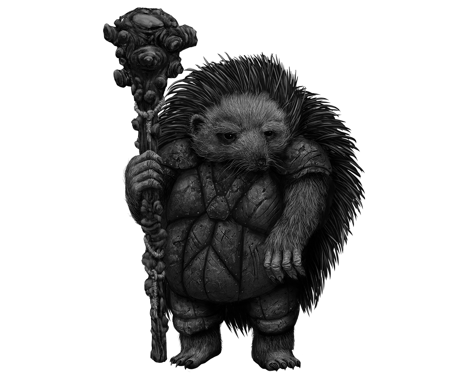
Ste’s artwork is incredible and he has brought these characters to life in ways that are far beyond what I could have envisioned.
The zine is coming along (slowly but surely) and is currently sitting at 32 pages long. Below are some work-in-progress designs for the cover and faction spreads.
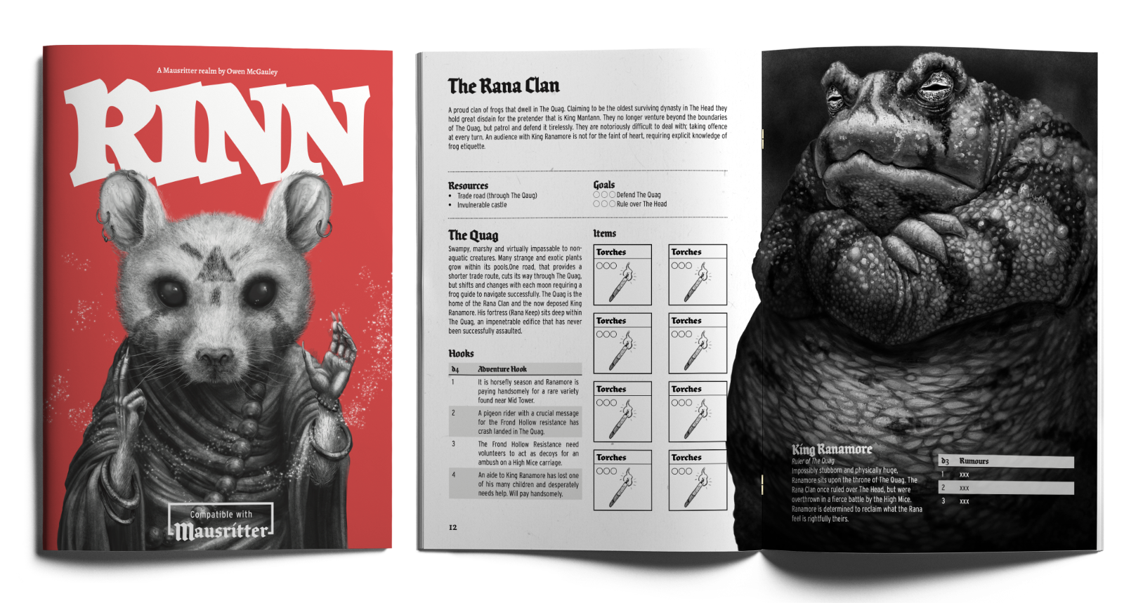
The aim is for the zine to act as more of a sandbox realm that encourages the reader to build their own adventures into Rinn. It won’t be chock full of stats or new rules, but a setting to base a campaign (or one-shot) in.
I hope to keep posting updates to Rinn as I make more progress. So watch this space!
01 Sep 2023